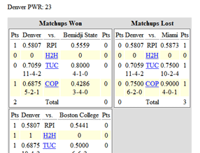
Most readers know they can find the current PairWise Rankings (which mimics the selection process the NCAA uses to seed the tournament) on SiouxSports.com’s PWR Rankings page. For those who have a deep knowledge of PWR and like to dig deeper to see the detailed data behind how it’s currently being calculated, SiouxSports.com has long offered the most thorough PWR details data on the web.
Having been an avid consumer of that data myself for many years, I’ve been working on presenting it in a way that makes it easier to inspect and analyze. Without further ado:
The way most people use this page is to try to figure out which comparisons for a given team are most likely to flip. I did that with the old page by scrolling through all the comparisons looking for those that were close, then diving into the details of those that were close to see if any of the criteria could flip.
I think that’s much easier with the new, one page grid. The comparisons are all in a single column on the left, color coded by how close they are. Then, scanning across a single row for all the comparison criteria for a team is similarly easy, again with color coding to indicate whether the comparison is won or lost and by how much.
As in the old page, additional details are available for each H2H, TUC, and COP comparison by clicking on each underlined result. Those details include not only what games contribute to the current comparison, but also what future scheduled games will affect it.

